So you want an iconic logo like Apple or Nike?
Every project I’ve ever worked on started with a name and a logo.
The logo is what gives an idea an identity. It’s what makes it real. Or, at least closer to being real. Once there’s a logo, there’s something to talk about, something to show people.
As you start designing your logo, you begin to understand the character and personality of the brand. The logo is initial the shape that defines how it’s presented. It sets the tone for how you want people to react and interact with your company.
The logo is the most important element of any brand.
The challenge when starting a new company is thinking you need to have the perfect logo.
We think of iconic brands we know, like Apple and Nike, and want a logo like theirs. A simple logo that transcends cultures and is strong enough to carry the weight of an entire company. A logo people immediately recognize.
In need of a logo, Nike founder Phil Knight contracted a local student to design a logo for $2 an hour.
The problem is, when we think that way, we miss the fact that these companies have over 45 years of history that give meaning to their logo.
Started in 1976, Apple’s first logo was actually a drawing of Isaac Newton sitting under an apple tree, it was changed a year later to the Apple icon.
Your logo doesn’t need to be perfect.
The apple logo is a flat apple icon with a bite taken out of it. The Nike logo is an abstract image of the corner of a running track. These shapes wouldn’t mean anything to you if the companies hadn’t spent years developing exceptional products and artfully marketing the company as a brand people like you should love.
So, yes, the logo is the most important element of a brand’s identity. But it’s not the brand. Brands are built over time and are the result of everything a company does and presents itself with.
Simply, a logo isn’t going to define your company. It’s just one of the ways for people to identify it.
This is why I’m saying your logo doesn’t need to be perfect. It doesn’t even need to be great. It just needs to be good.
Designing 100 logos.
To test this theory, I challenged myself to design 100 logos in 100 days.
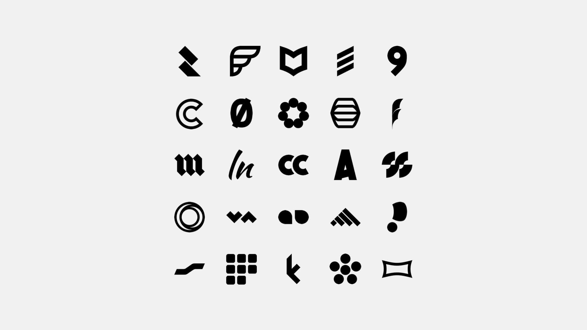
These are some of my favorites. You can see the reset on instagram @wesjonesco.
The purpose was to develop a set of principles unique to designing logos for startups.
I did this because all logos begin as startup logos. A company’s first logo sets the foundation for what it can become. The only difference between a startup logo and an established brand is the history the company has. And while some logos have stood the test of time, most evolve as the brands mature.
This isn’t to say your first logo can’t be like Apple or Nike. Only you can’t expect people to recognize or care about your’s the same way. At least not in the beginning. In the beginning, all you need to do is give people something to identify your company with, and by implementing these five principles, you’re going to have the best chance at doing that.
Your first logo doesn’t have to be your forever logo.
You need something to get started. Something good enough to feel ligament. But, you don’t want to overcommit to something before you know more about where you’re headed.
You just don’t know enough when you’re starting out.
Design principles for startup logos.
While the principles are meant for designing startup logos, you’ll see how they are fairly universal and could also be used by established brands who want to completely redesign their logo or brands looking to refresh and update their existing one.
So, whether you’re designing the logo yourself or are having someone else do it, these principles are meant to help you develop a well-thought-out logo that’s appropriate for your business, sets the foundation for your identity, and is something you’re excited about.
And, most importantly, help you not get stuck overthinking it.
If this is what you need help with, these five logo design principles are what you’ll want to keep in mind.
1. Communicate the brand.
The only thing your logo needs to do is communicate your brand name.
Especially, if you’re a startup.
If you’re a startup, no one knows who you are. No one knows you exist. And, no one knows why they should care.
Your logo needs to introduce people to your brand.
To do this you’re going to want to design a wordmark. A wordmark is a stylized version of your brand name. This way you can communicate your brand name and have a unique design for people to remember.
Then, if there’s a time when you need something smaller, you can take the initials of the company to create a lettermark using the same design language.
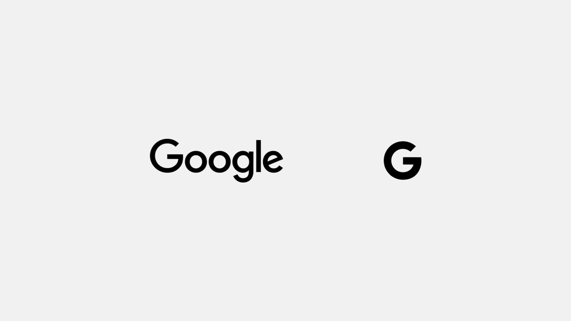
The consistent design language between the wordmark and lettermark helps strengthen the brand and lets the “G” stand on its own.
Companies like Google and Tesla do this well. They have their stylized brand names as their primary logo and then have G and T lettermarks for times when the primary logo is too large or doesn’t fit the context. Since both have the same design language there’s no mistaking what brand they’re representing. This continuity builds up brand equity as people associate one with the other.
Now, there are other logo formats you could use like emblems, mascots, and pictorial or abstract marks. But, at this early stage, it’s often too much to introduce people to both a brand name and another element unless it’s so literal there’s no mistaking what it’s for.
An example so obvious is YouTube and its Play Button icon.
Twitter, another brand that uses an icon, actually launched in 2006 with a wordmark and later added the bird icon in 2010. They then paired the wordmark and icon together until 2012 when afterward they’ve able to use the icon by itself.
Notice the subtle refinements between the wordmark as well as the bird icon as Twitter updated its identity as it became more established.
The trick to this is showing both the wordmark and icon together until the association is strong enough that they’re interchangeable.
2. Design in one color.
Every logo has to work in black and white.
And, when you’re first designing your logo, you should only work in black and white.
Adding color can be exciting and make a logo seem more dynamic, but color is subjective and leaves things open to interpretation both individually and culturally. Because of this, you should only use color to embellish and only if it’s absolutely necessary.
The reason you don’t want to rely on color because there will be times it can’t be displayed in color. And, by working in black and white, you know you’re designing a logo that’s durable and can work anywhere.
If it can’t work in black and white, it’s not a good logo.
The YouTube logo works perfectly well in black and white, the use of red is simply a way to tie in the color of a record button on movie cameras.
3. Make it scalable.
Your logo has to work everywhere.
Big, small, digital, print. Everything. While you’ll have guidelines for how people should use it, you don’t know where it’ll need to be placed. To plan for this, you need to make sure it can adapt to whatever environment, material, and context it’s in.
What you don’t want is to have to force-fit your logo into a high-profile placement because you didn’t think beyond your website.
The Walt Disney logo is a responsive logo designed to work at many different sizes without losing any of its meaning.
A good logo will have visual weight and contrast to be recognizable from a browser tab all the way up to an airplane or the side of a building. This is why I think the right approach is to use a wordmark as the primary logo with a secondary lettermark for times when a smaller size is needed.
The point is you can’t overcomplicate it and have your logo try and do too much.
4. Timeless, not trendy.
Timeless design is sophisticated and elegant. It’s meant to be highly functional, adaptable, and subtle without being bland or boring. Rather than looking old or new, it’s intentional, appropriate, and durable.
These are the qualities you want.
If you chase trends, you’re going to be left with a logo that looks dated as soon as it passes. And instead of being a brand that conveys confidence and awareness, you’ll be seen as one who is out of touch and trying hard to stay relevant as you redesign your logo to keep up.
The Olympics logo is as timeless as it gets.
5. Your logo doesn’t have to work forever.
We place so much importance on the logo in the beginning because it’s often all we have. We don’t have a website, we don’t have a product, and we don’t have customers. All we have is an idea.
And having a logo is what starts to make an idea feel real.
So it’s understandable why we think our logo is so important. But we also have to remember that it’s not critical. All we need is something to get us started. Because at this point, no one knows who we are, no one knows what we do, and no one has a history with us as a brand.
Starbucks has consistently updated its logo to match contemporary design trends without losing the foundational elements of the brand.
A logo isn’t that important until we develop our idea into something people can interact with.
Then you can gauge what people are saying and whether or not the logo supports the company’s values, products, and direction. If it does, great. If not, no problem. Now you have a better idea of what your company stands for and can design a logo that better fits your brand.
Designing iconic logos.
That’s it. It’s really quite simple.
A good logo communicates the name of your company, works everywhere, and is easy to remember.
A bad logo is either too generic and doesn’t say anything at all or is overly complicated and falls apart as it tries to say too much.
In the end, it comes down to understanding your logo is not your brand. It’s just one way to identify it. These principles are meant to point that out. Not that your logo isn’t important. It’s just not as important as the other aspects of your business, like your products, values, and marketing strategy.
The Nike logo didn’t mean anything at first. Founder Phil Knight even said, “Well, I don’t love it, but maybe it’ll grow on me.” Obviously, the Nike logo has become one of the most iconic logos in the world. But it wasn’t the logo that did that. It was everything else the company did that gave the logo meaning.
So while we set out to talk about design principles, we ended up discovering what it really takes to have an iconic logo.
That is, if you want a logo people remember, build a company worth remembering.
How much does a logo cost?
Ok, an article about logo design for startups feels incomplete without a few notes on pricing.
If you’ve looked into it at all, I’m sure you’ve found the price range for logo design goes from $5 to hundreds of thousands or even millions of dollars.
Now, I know that range doesn’t really apply to startups.
Startup logos tend to be about 10 to $20,000 for Seed or Series A funded companies. Down to about $5,000 for a well-capitalized bootstrapped startup. Below that, you can find something at whatever budget you have to spend. The thing to know is, at these lower levels, there might not be much difference in the quality you get whether you’re spending a few thousand or a few hundred dollars. The real difference is that you will have to do a lot more vetting to get someone and something worthwhile.
And, you might actually end up spending more in the end if you only look for the cheapest price.
These price differences really come down to the value the logo will bring to your company, how much discovery and process work will go into developing your logo if there are any legal and compliance requirements to work through, and the reputation of the designer or firm you end up working with.
So while I say you don’t need a perfect or even great logo, there’s definitely a threshold for good, which I hope the principles above will help you recognize and be able to talk about better.
It’s worth noting too. You’re most likely going to be working with an individual for anything less than $5,000.
Want me to design your logo?
If you’re interested, I charge $425 for initial logo designs.
I charge this low rate because I’m not trying to make a living by designing logos. I just love doing it and want to help new projects get off the ground. If you want to work with me, you’ll have a logo within a week and you can learn more about the process and how to kick things off on this page.
And, for what it’s worth, Phil Knight paid $35 for the Nike logo. Twitter bought the first iteration of its bird icon from a stock photo site for $15. And the Coca-Cola and Google logos were both designed by one of their founders for $0 each. The secret then is, with a little bit of luck and if you’re able to commit to something, you might not have to spend much.